Voodies - Food Sharing Startup
During my time here, I embraced the role of sole product designer, steering the complete UX and UI journey across a sophisticated platform. I crafted intuitive experiences for new features within a complex data integration environment, managing every step from initial discovery to seamless developer hand-off. Collaborating closely with customer success managers, engineers, and stakeholders, I ensured design aligned with both business goals and technical realities.
Problem Identification
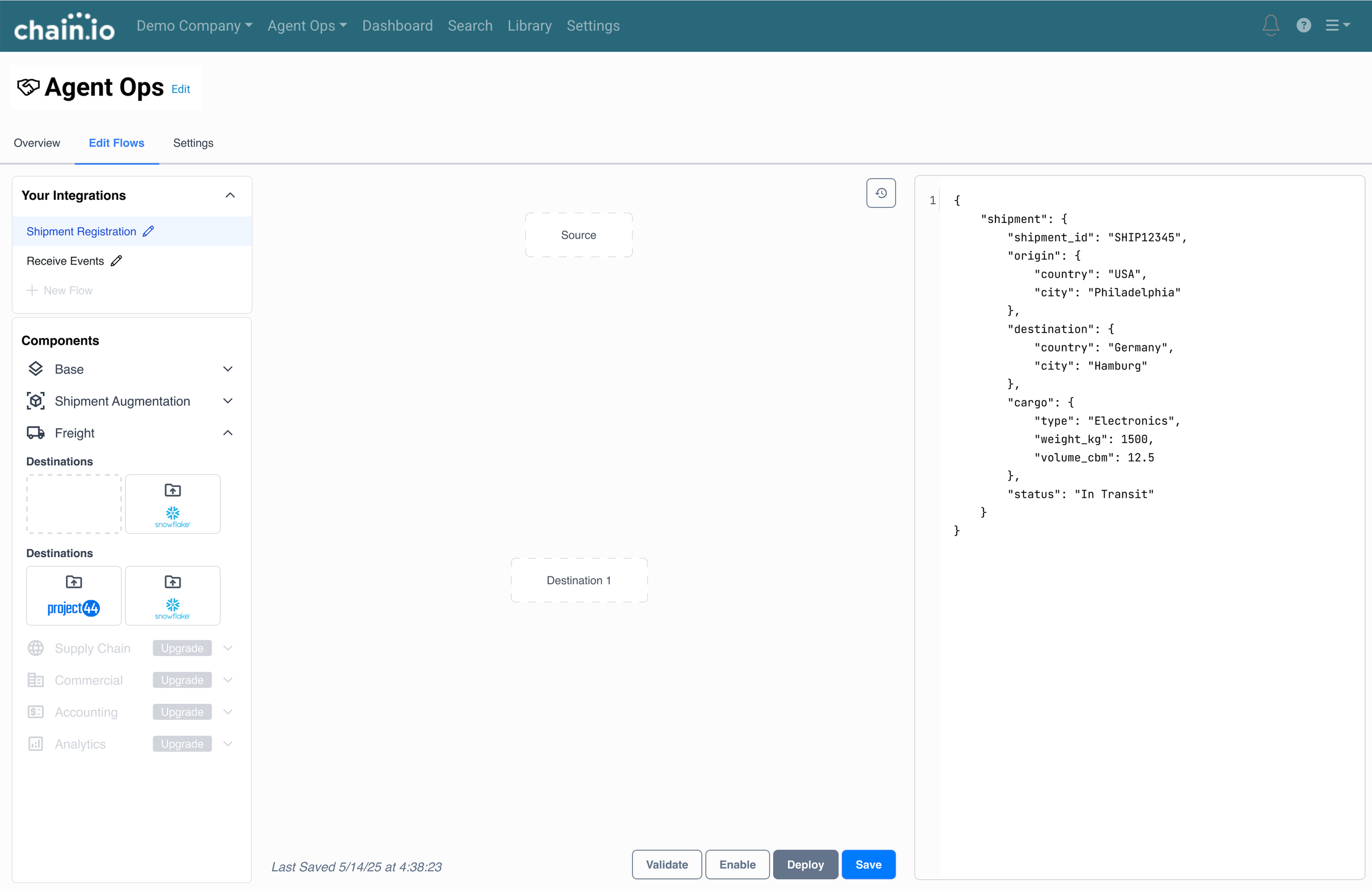
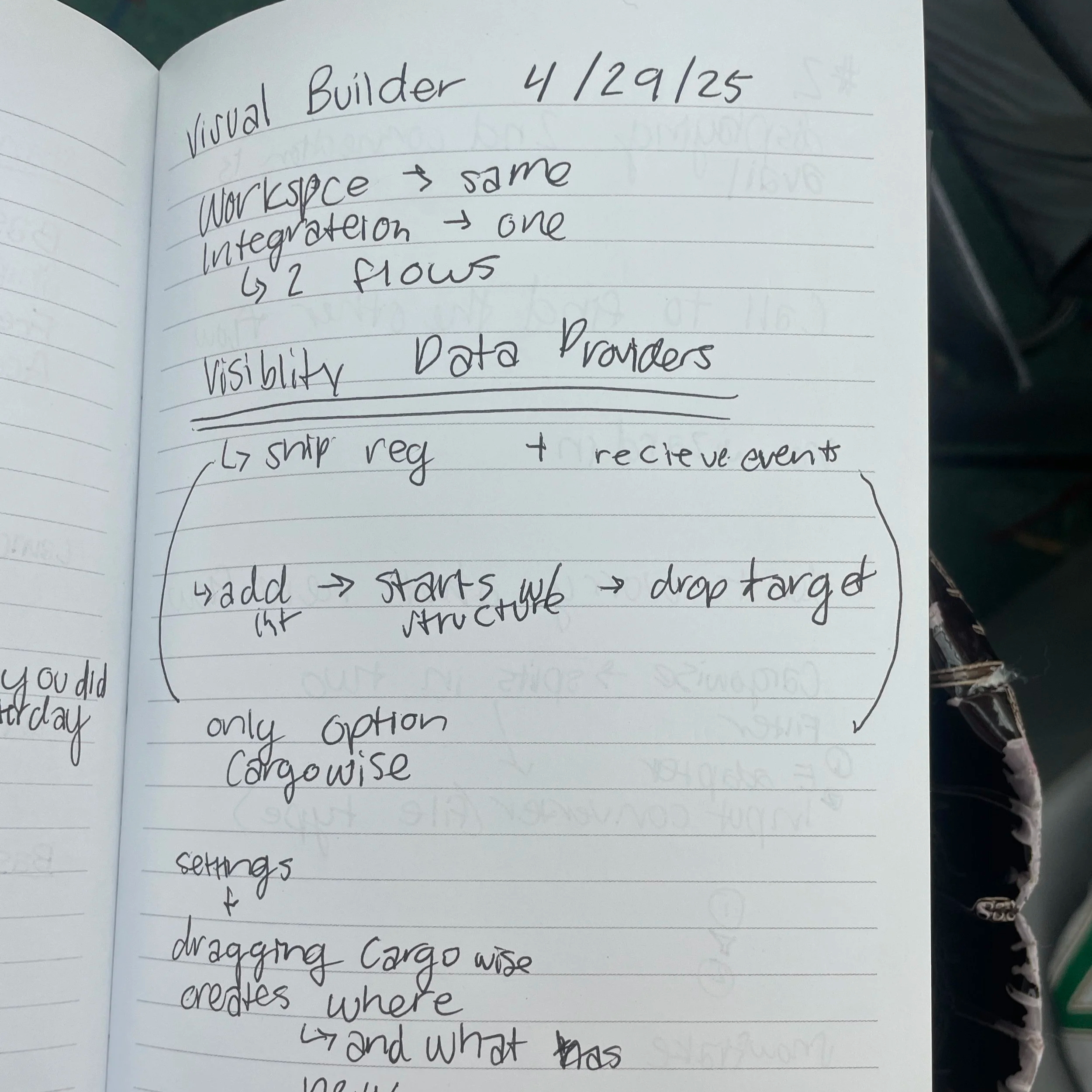
Users typically need a lot of assistance from Customer Service Managers in order to build flows. The current screen to create their own flow is clunky and overwhelming. Users don’t have a visual for how their integration will be executed (for example, when does the pre-processor run within the flow), and branching is not a capability. If users are more aware of how they can expand their flows, it creates an opportunity to upsell customers.
Ideate
This project required rapid iteration and the vision changed quickly. To avoid running into future problems, we had many meetings to understand limitations and what each stage of design would mean.
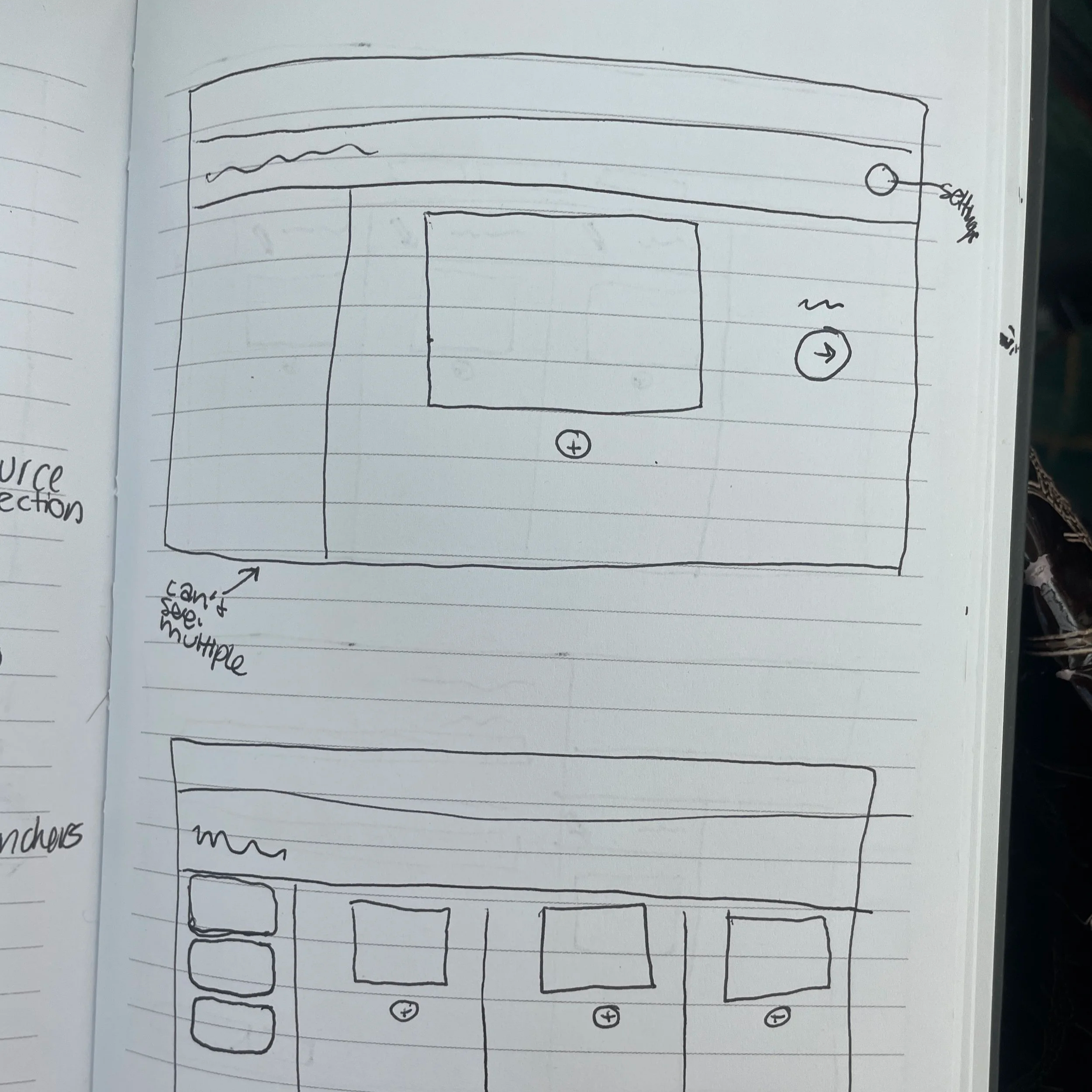
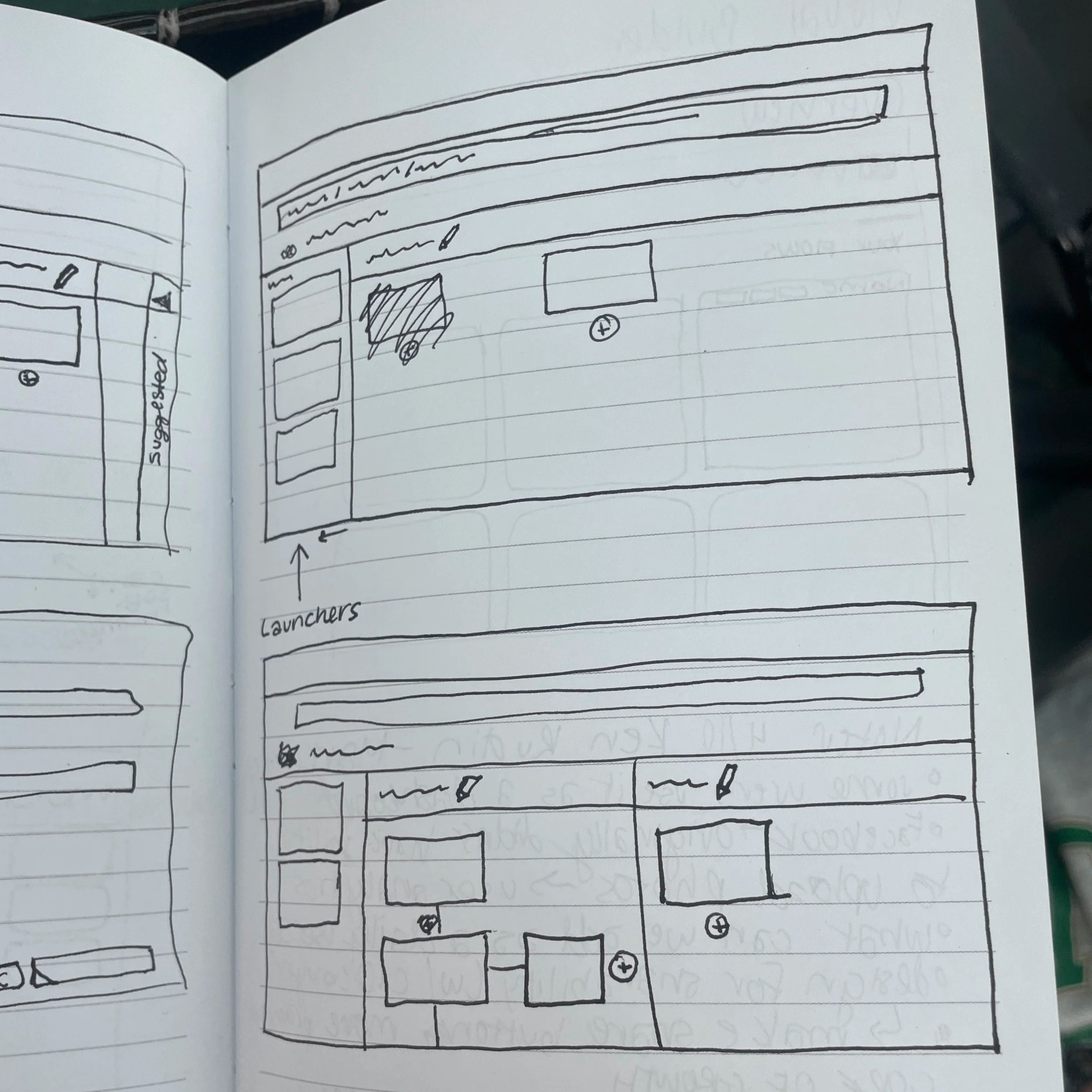
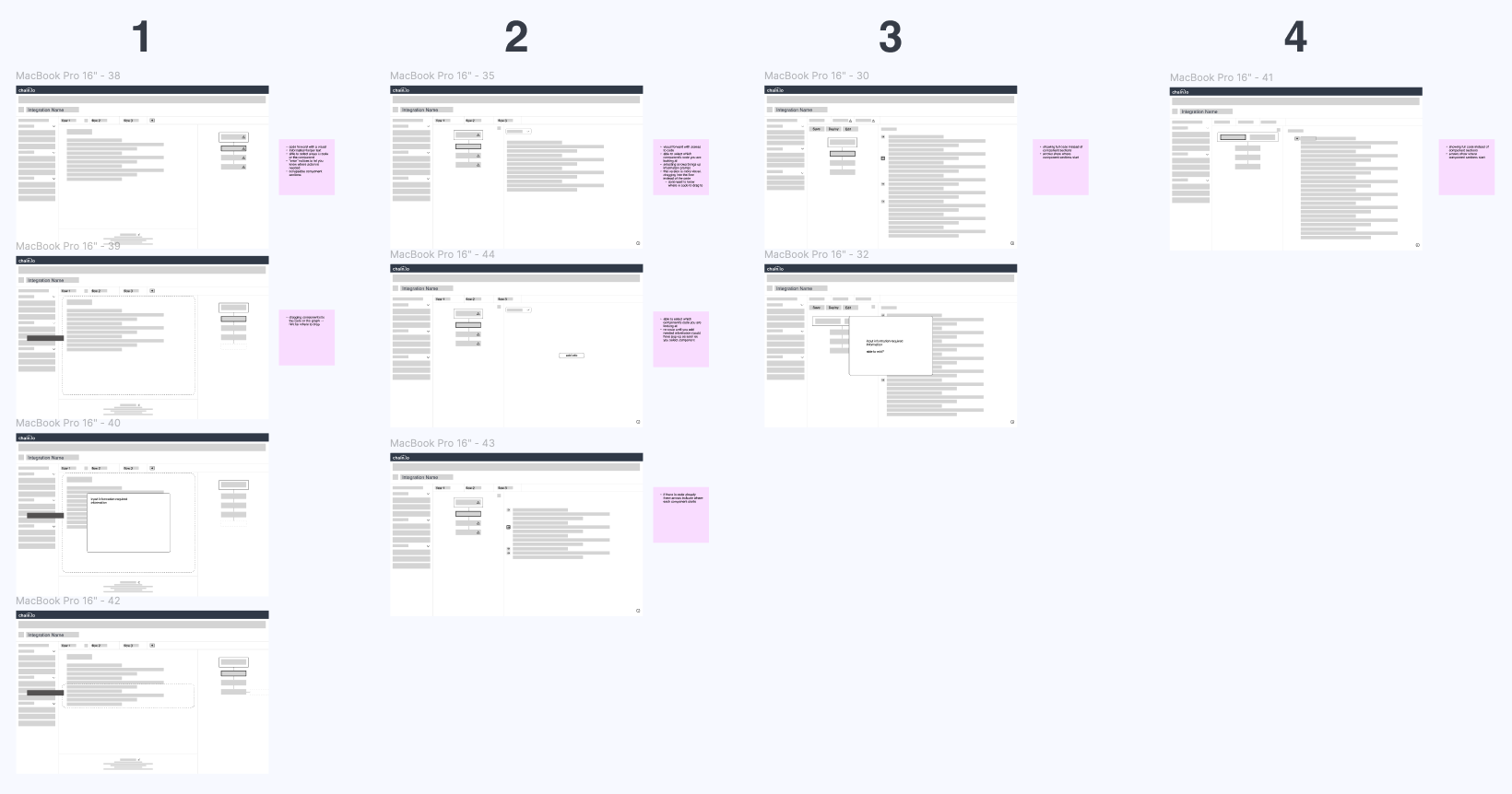
Wireframing
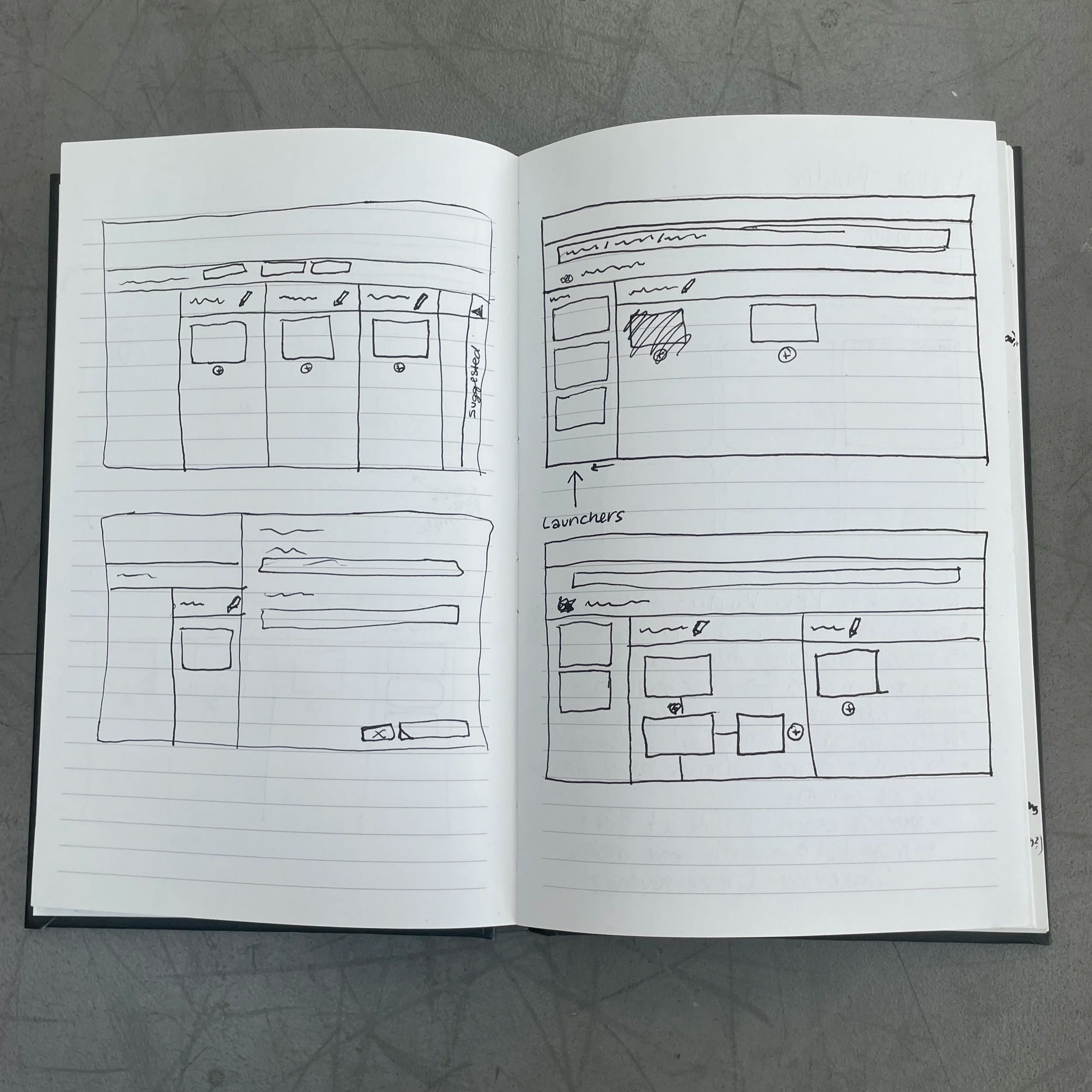
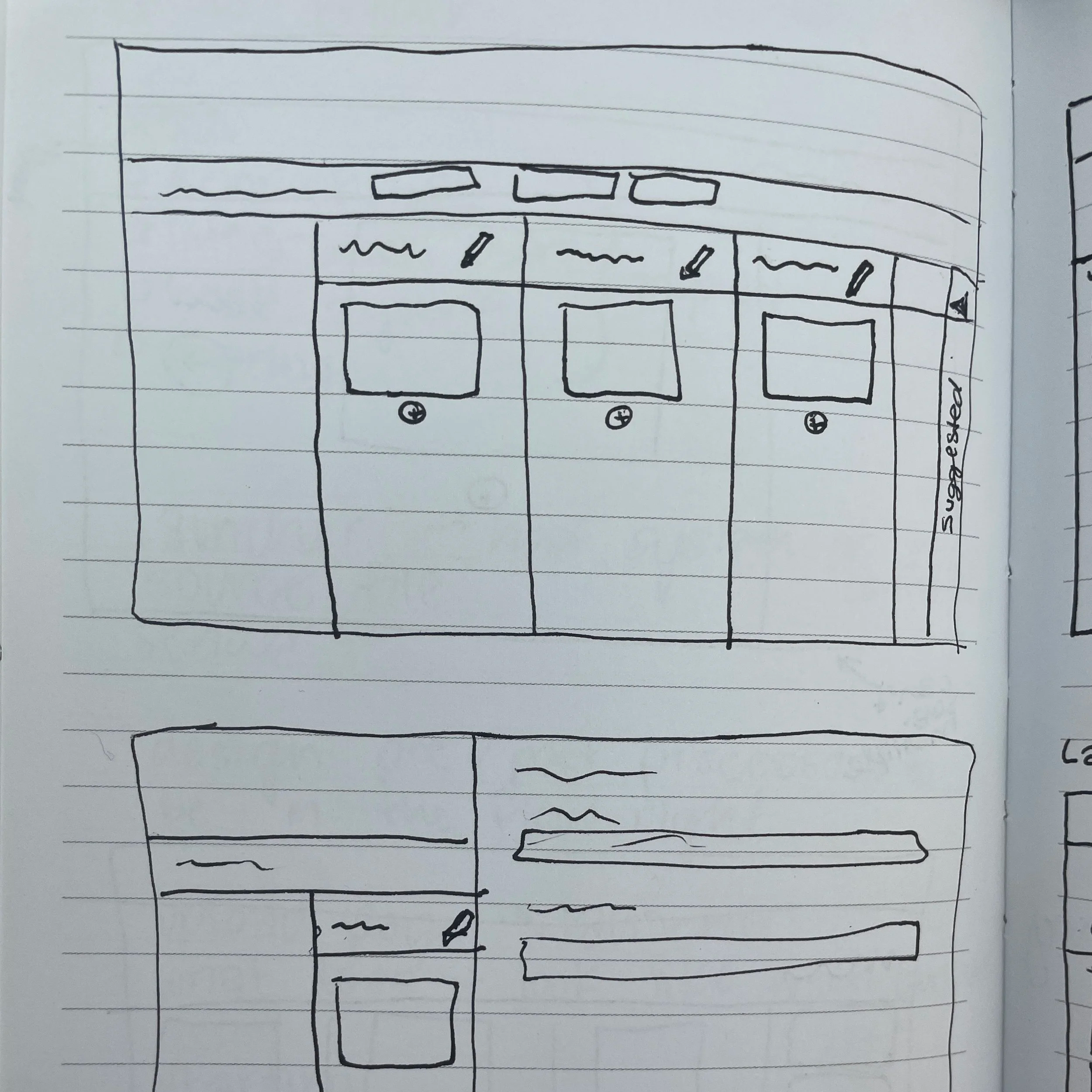
Using information gathered in brainstorming sessions and rough sketches, I started creating low-fidelity wireframes. In the end, I had four different options for the screen layout. Normally, I avoid having so many layout options, but since the concept was still in early development, I wanted to cover all of our bases. Each version included notes of important differences or potential problems we could run into.
Considerations
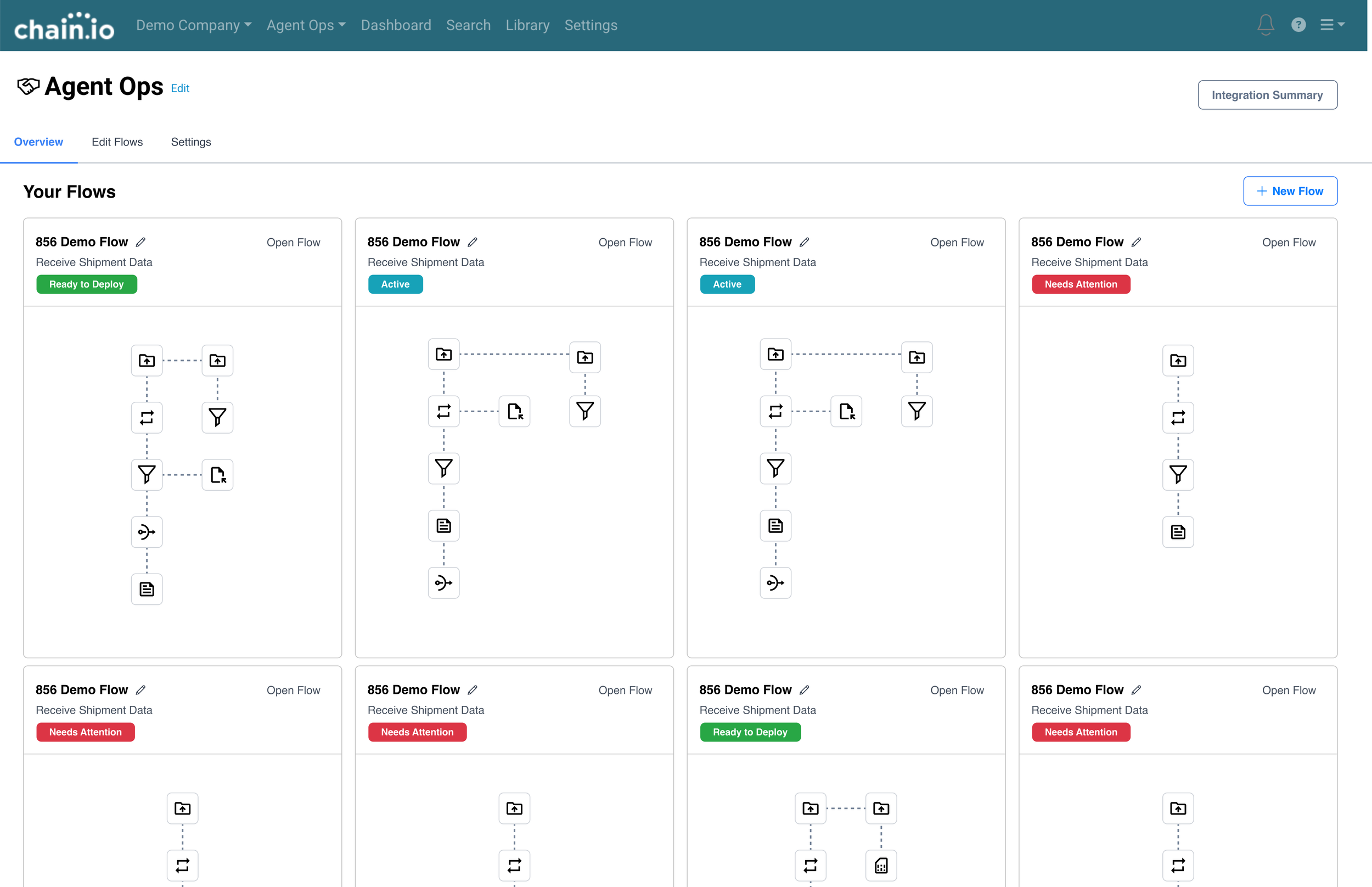
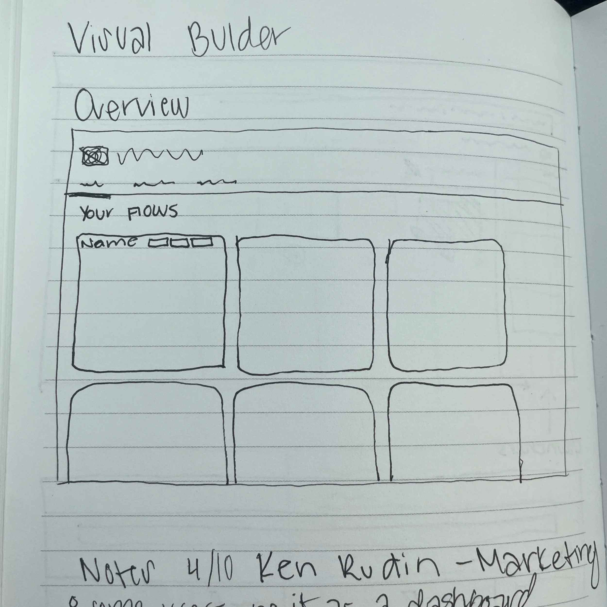
Overview Screen
What should users be able to see in the overview section?
Don’t overload with information!
Could users see specific tasks here?
Users should be able to quickly share executions and tasks to promote in-cycle marketing
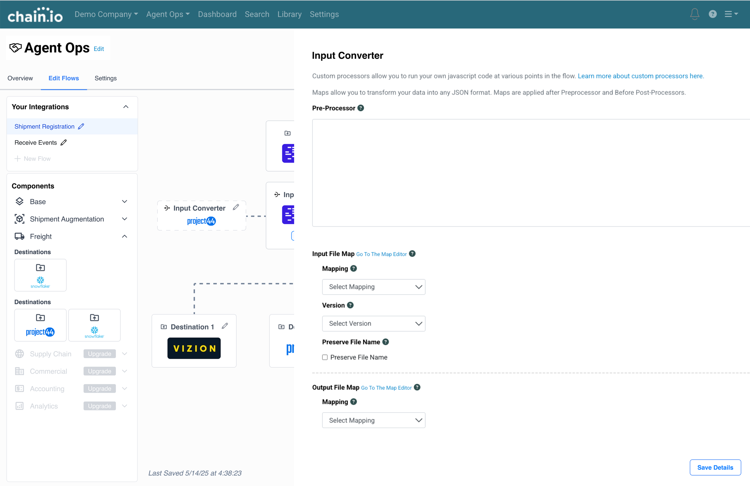
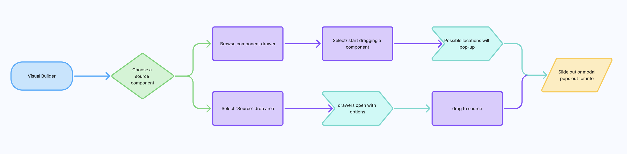
Component Drawer
When you select a component from the drawer, what happens?
What is already on the screen or is it a blank slate?
How are components organized and what information is shown?
Potential for up sale with “Upgrade” indicator
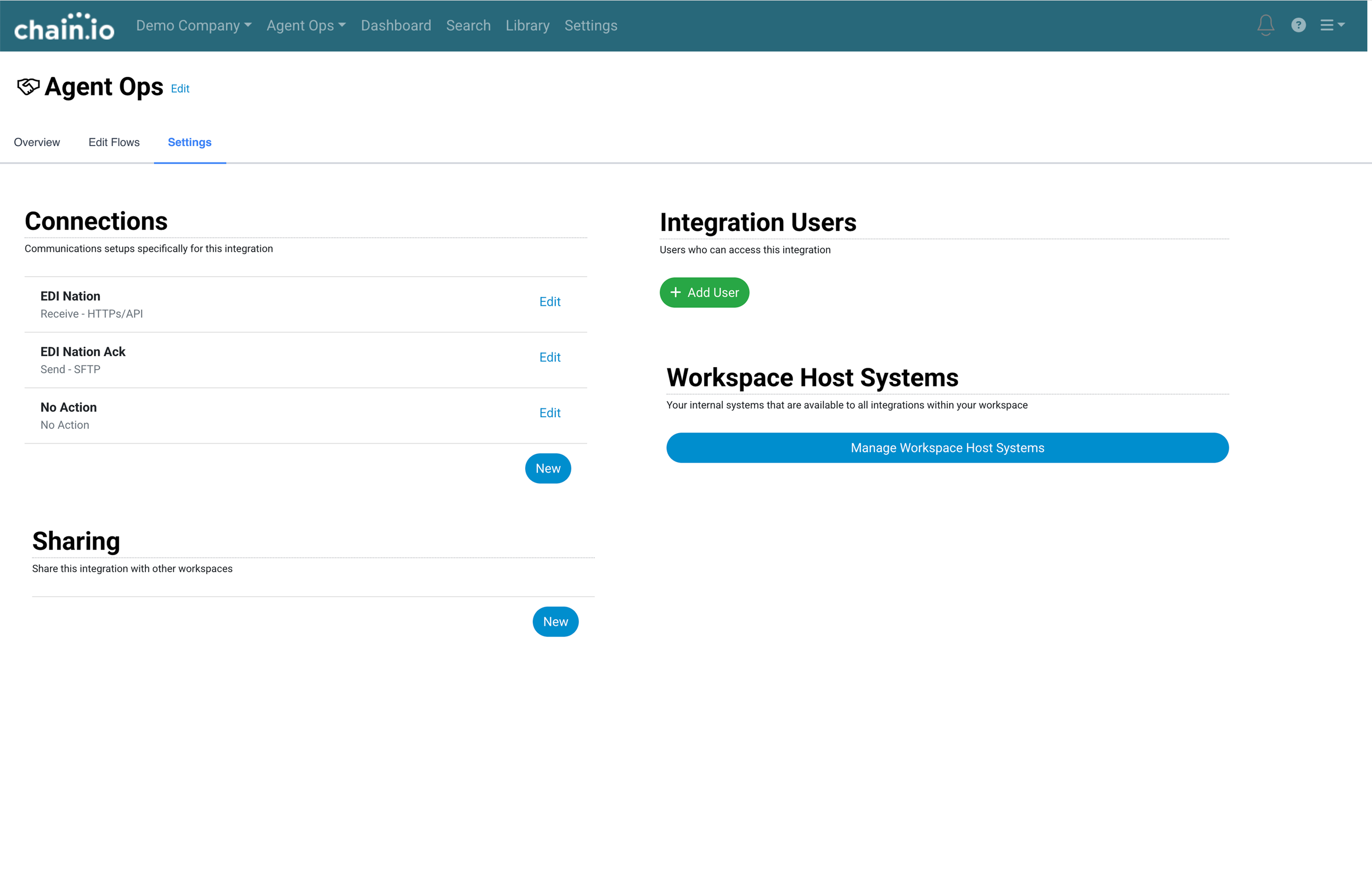
Deleted Screens
What screens can be replaced by the visual builder?
What items can be relocated?
How do we ensure users can find what they need and don’t get lost?
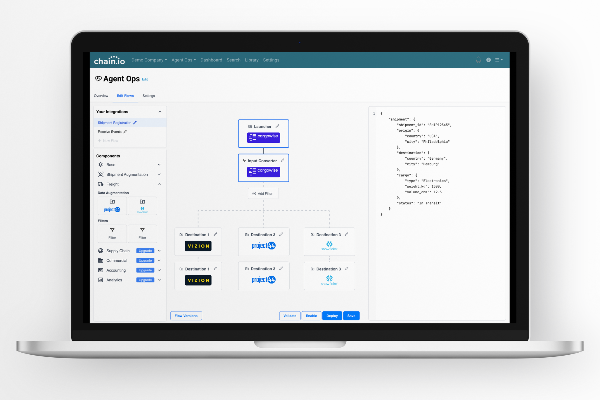
Final Results